Build guide
How this site was designed & built
A genuine walkthrough of the Isabell's Home Care showcase — the creative reasoning, the imagery art direction, the animation techniques, and the accessibility decisions. Everything here is reproducible with plain HTML, CSS, JS and a couple of CDN scripts.
1 · The concept: the opposite of an insurance brochure
Most senior-care websites fail the same way: they look like insurance paperwork. Cold blues, stock photos of worried seniors staring out of windows, clinical language ("activities of daily living", "care solutions"), and a quote form where a phone number should be. The emotional read is pity and process — exactly what an adult child feels guilty about, and exactly what a senior dreads.
So the design brief was one sentence: make it feel like a well-loved home, not a facility. Every decision below traces back to that.
- Founder-led, first person. The company is named after a person, so the brand behaves like one: an italic serif wordmark that reads like a signature, a real founder's letter ("I started this company for my own mother"), and the promise that Isabell still answers the phone.
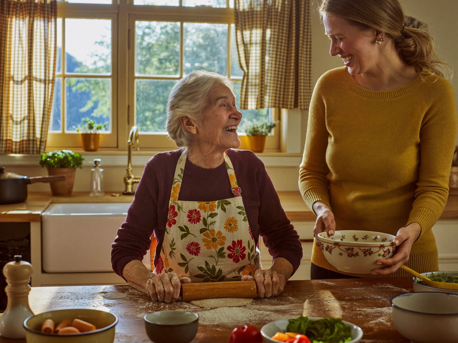
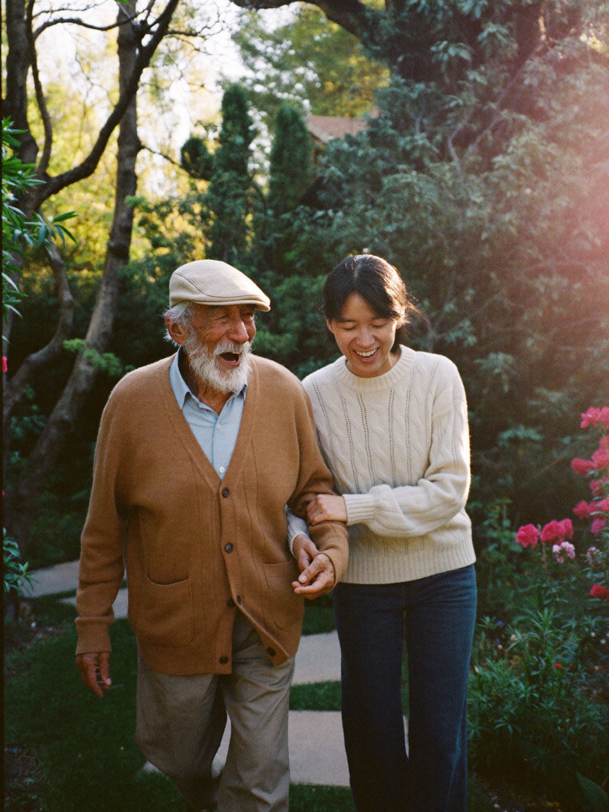
- Joy, not pity. Every photo shows genuine laughter, activity and dignity — baking, card games, garden walks. No hospital settings, no scrubs, no sad seniors. The category cliché is the wheelchair-by-the-window shot; we banned it at the prompt level.
- The phone is the CTA. This audience calls. The number appears in the nav pill, the hero button, and a giant serif
tel:link in the closing band of both pages.
2 · Palette: linen, terracotta rose, plum ink
Warm ivory ground so the pages feel like linen and lamplight rather than paper and fluorescent tube. Terracotta rose carries warmth and action; a deep plum-charcoal replaces pure black so even the text feels soft; sage and honey gold are supporting notes (icons, flourishes, card accents). Deliberately distinct from the showcase's dental site (cream/mint/apricot) and wellness retreat (sage/sand) — here sage is a garnish, never the lead.
3 · Typography & the large-type decision
Fraunces (a warm, wonky humanist serif with real character) for display, Nunito Sans (rounded, gentle, extremely legible) for body, and Caveat only for Isabell's signature and one photo caption — handwriting is a spice, not a font.
The body size is 19px with 1.75 line-height — noticeably larger than a typical marketing site. That's deliberate: the audience is adult children and seniors themselves. Presbyopia is near-universal after 60, so 16px body text quietly excludes half the audience. Larger type, generous line-height, and real contrast (plum ink on linen is ~11:1, well past WCAG AA — most pairings clear AAA) make the site readable without anyone reaching for their glasses. Big type also feels calmer and more confident, which suits the brand.
4 · Imagery: art-directing away from the category cliché
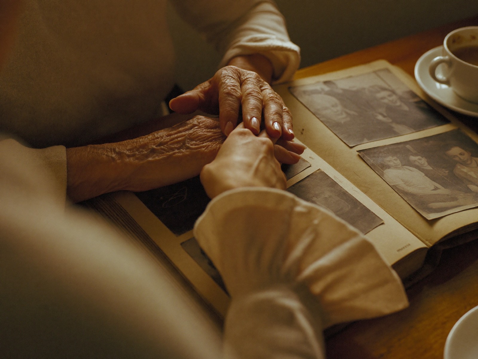
All eight photos are AI-generated, then compressed to ≤1600px JPEGs to keep the site fast. The creative direction was the point: every scene shows genuine joy and activity — laughing, baking, card games — never anything passive, clinical, or pitying, with warm natural light and caregivers dressed like family rather than staff.
How each photo was briefed
Every image began as a carefully art-directed brief — the lighting, lens feel, palette, composition and emotional register specified shot by shot — and was iterated until it matched the warm, dignified world of the brand. The eight scenes: the hero tea-and-laughter moment, Isabell's window-light portrait, hands over a photo album, a garden walk at golden hour, baking together, reading aloud on the sofa, a card game with a big laugh, and arranging flowers in a bright kitchen. The full brief library is proprietary to the studio — available to clients on request.
5 · Motion: tender and unhurried
GSAP 3 + ScrollTrigger from the jsDelivr CDN. The motion language is deliberately slow and soft — nothing snaps, nothing bounces. Three techniques carry the whole site:
a. The self-drawing flourish (the signature move)
The underline beneath "warmth" in the hero, the little heart in the wordmark, and the dotted thread connecting the three steps are all SVG paths that draw themselves using the classic stroke-dash technique — measure the path, offset the dash by its full length, then animate the offset to zero when the element scrolls into view:
document.querySelectorAll(".draw-me path").forEach(function (path) {
  var len = path.getTotalLength();
  gsap.set(path, { strokeDasharray: len, strokeDashoffset: len, opacity: 1 });
  gsap.to(path, {
    strokeDashoffset: 0,
    duration: 1.4,
    ease: "power2.inOut",
    scrollTrigger: { trigger: path.closest("svg"), start: "top 88%", once: true }
  });
});
A hand-drawn line that draws itself reads as human — it's the motion equivalent of the founder's signature.
b. Soft reveals with stagger
Everything content-level uses a single [data-reveal] attribute (fade + 28px rise, 1.05s, power2.out) or [data-reveal-group] for card grids, where children rise one after another at a 0.14s stagger. One system, applied everywhere, keeps the two pages feeling like one hand built them.
c. Gentle parallax + count-ups
The hero photo is scaled to 112% and drifts ±6% on scroll (scrub: 1.2 so it lags dreamily behind the scrollbar). The trust stats count up from zero the first time they enter the viewport.
Accessibility note: all motion is wrapped in aprefers-reduced-motioncheck — reduced-motion users get a fully static, fully visible page. And because reveals are applied via a.jsclass on<html>, users without JavaScript see all content too.
6 · Design details that say "care"
- Arched photo frames — the hero and portrait images sit in rounded-top "window" shapes, an architectural echo of home rather than the sharp rectangles of a brochure.
- Rounded everything — 22–32px radii on cards, pill buttons, soft blurred color blooms behind the hero.
- A taped letter — the founder's note is a cream card with a translucent washi-tape strip at the top, and the signature is set in Caveat.
- Dashed dividers & dotted threads — stitched, hand-made textures instead of hard rules.
- Honest FAQ copy — real answers with real numbers (cost ranges, start times), because trust is a design feature.
7 · Structure & tech
- Plain HTML/CSS/JS, no build step. One shared stylesheet (
assets/style.css) and one shared script (assets/main.js). - Two content pages + this guide, with consistent nav and footer; the subpages reference assets with
../relative paths, so the folder deploys anywhere as-is. - FAQ uses native
<details>/<summary>— keyboard-accessible and screen-reader-friendly for free, styled to match the cards. overflow-x: cliponhtmlandbodyso the bleed blooms never cause horizontal scroll; responsive from 375px to 1440px+ viaclamp()type and grid collapses at 62/56/47.5/46/40rem breakpoints.
8 · Deploying on Netlify
The site is a static folder, so deployment is drag-and-drop:
- Go to
app.netlify.com→ "Add new site" → "Deploy manually". - Drag the
isabells-carefolder onto the drop zone. Netlify servesindex.htmlat the root and thecare/andguide/subfolders as clean URLs (/care/,/guide/) automatically. - Rename the site (Site settings → Change site name) or attach a custom domain.
Or with the CLI:
npm i -g netlify-cli
cd isabells-care
netlify deploy --prod --dir .
No build command, no environment variables, no framework — that's the point.